CopyTrading
A new product category for the broker – mobile and web, built from zero with no brief.
About
CopyTrading is a two-sided marketplace: expert traders sell their strategies, and beginners copy them. I led it from zero – research, architecture, and the full design across mobile, web.
One conviction ran through every decision: in a market that's rigged against the beginner, the product's first job is to protect them.
Outcome
I designed the whole product: both roles, mobile and web, every state, full flows, and clickable prototypes.
Problem
Two roles, opposite jobs. Copy trading lets one person copy another's trades. So the product has two users with opposite goals. Serving both at once is the tension.
Masters
Build a strategy and want to get paid
Investors
Copy strategies and try not to lose money
And the sides aren't equal. Copy trading is full of scams, and the investor is the one who gets hurt. So before we drew a screen, we made the call that shaped everything after: the product's job is to protect the investor. It could live without masters, but not without protected investors.
We also started with no brief: leadership said "build what matters for users," nothing more. Defining the brief was the first design task.
Research
Research the users and the market together
One week, two inputs.
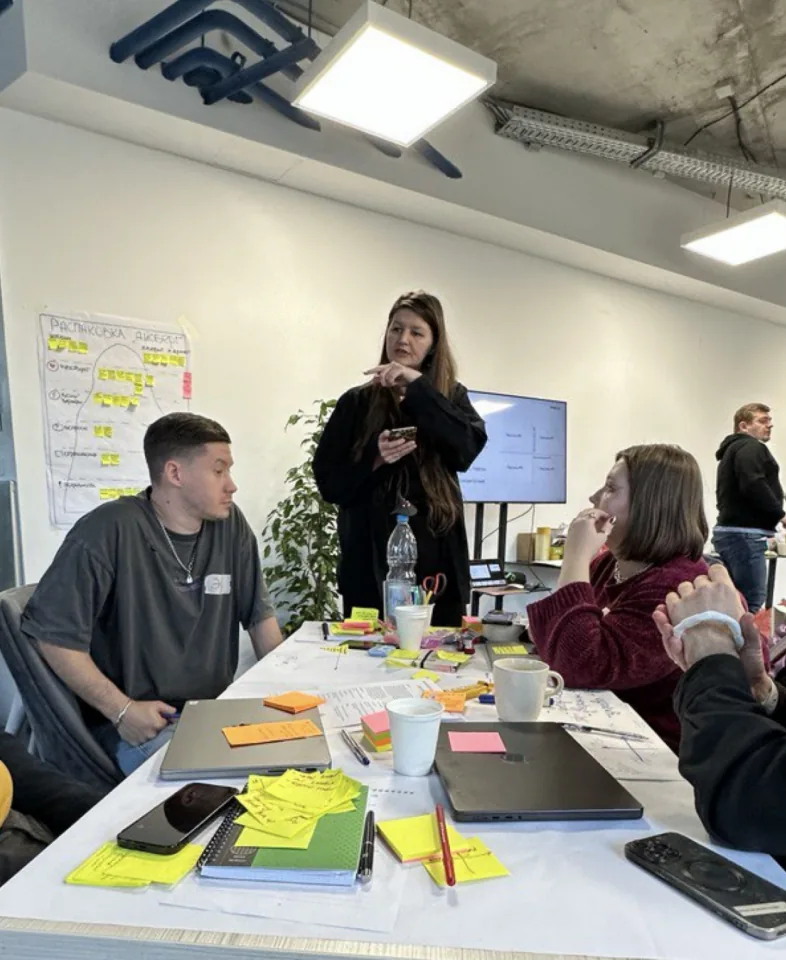
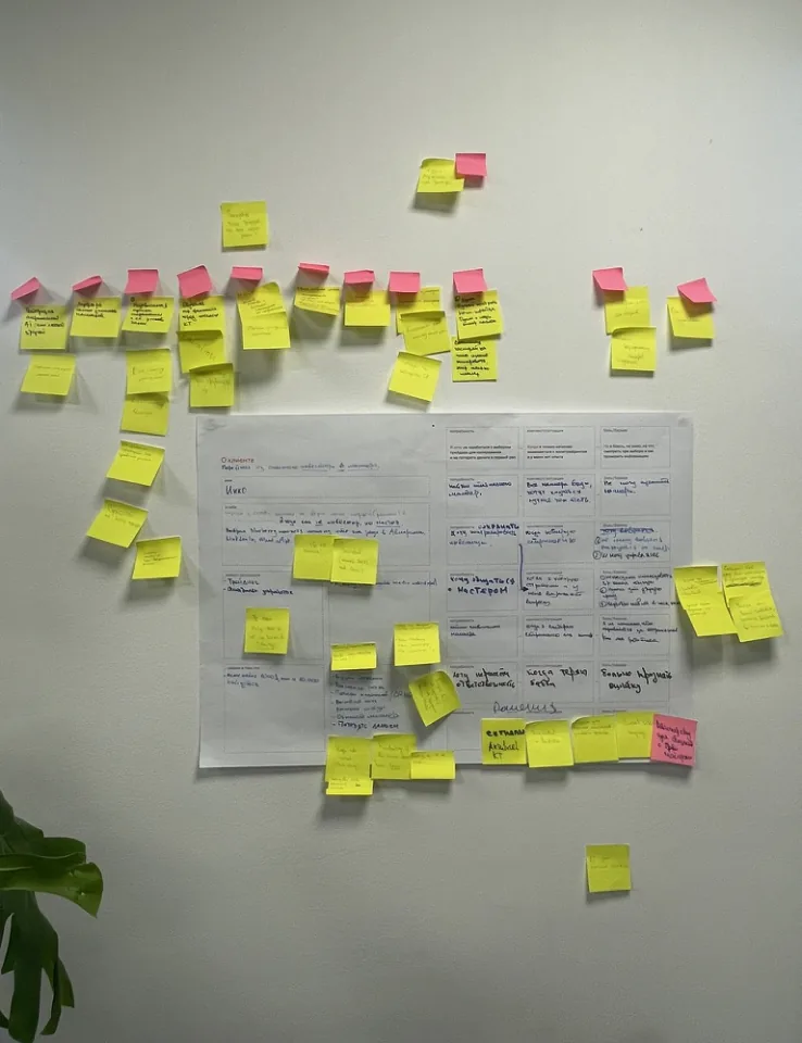
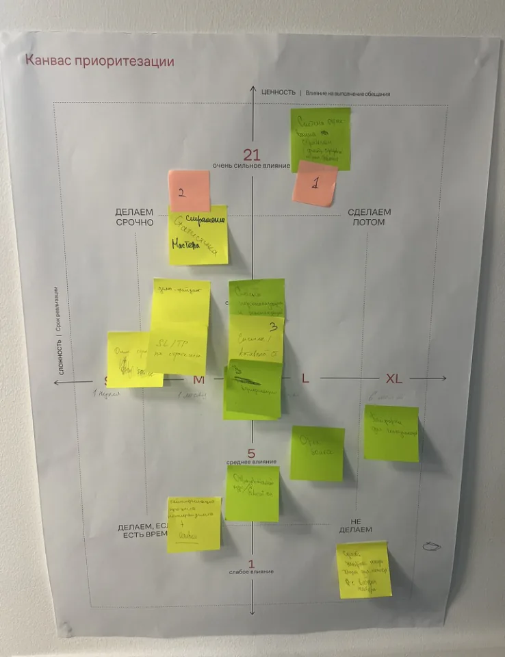
A service-design session: we split into three groups, one per user type (newbie, experienced trader, master), interviewed them, turned each finding into a feature, and scored them into an MVP backlog.
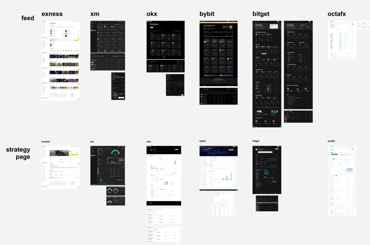
Alongside it, I studied every major competitor – how they're built, what users already expect, where they fall short.
Three findings shaped the product:
- The two roles aren't fixed. A newbie often grows into a master with their own copiers. So I designed for the journey between roles, not two static types.
- Users didn't want complex strategy filtering, so I cut it.
- The standard terms confused even expert traders, so I fixed the wording with our UX writer.
Turn research into structure
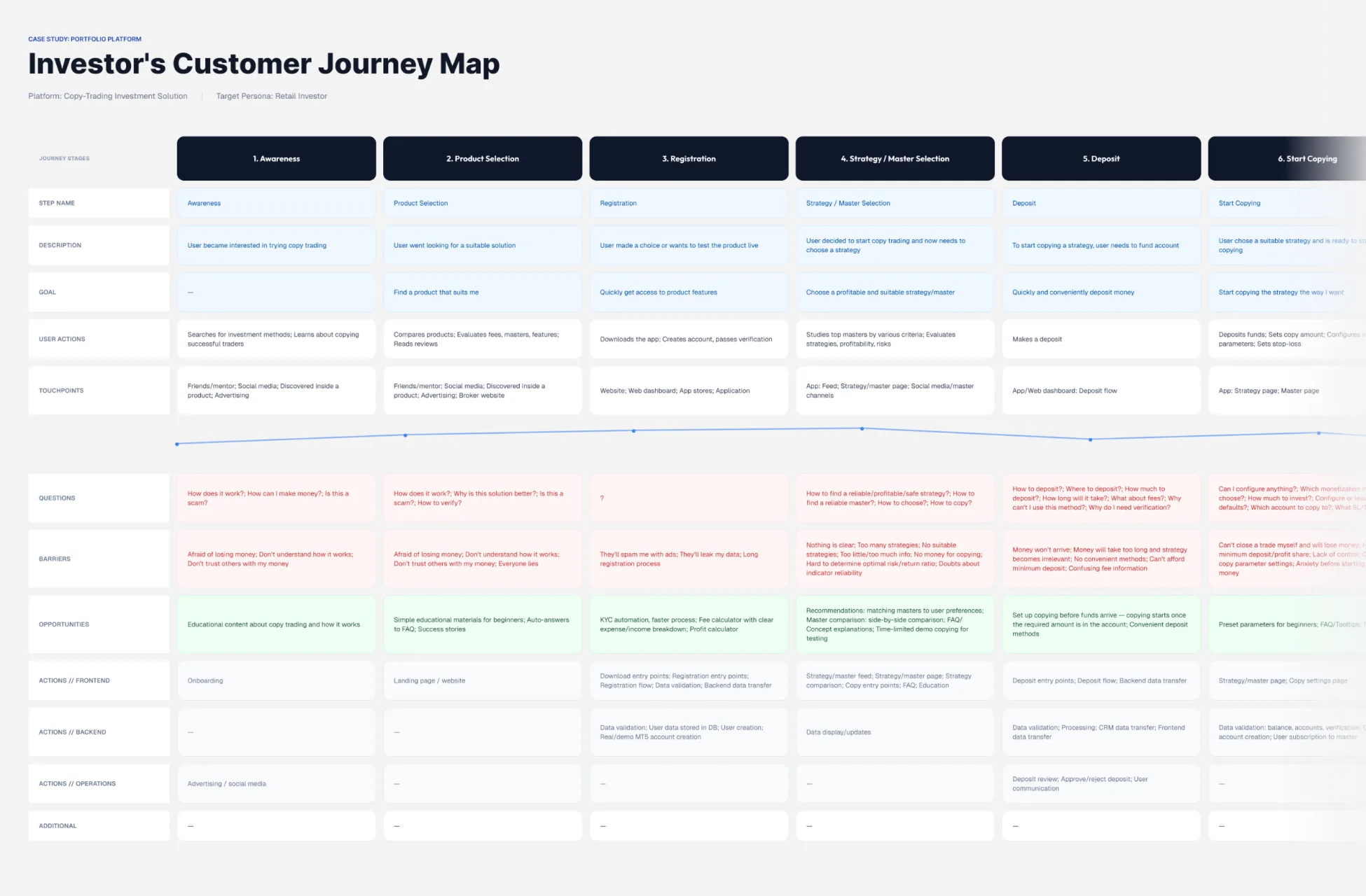
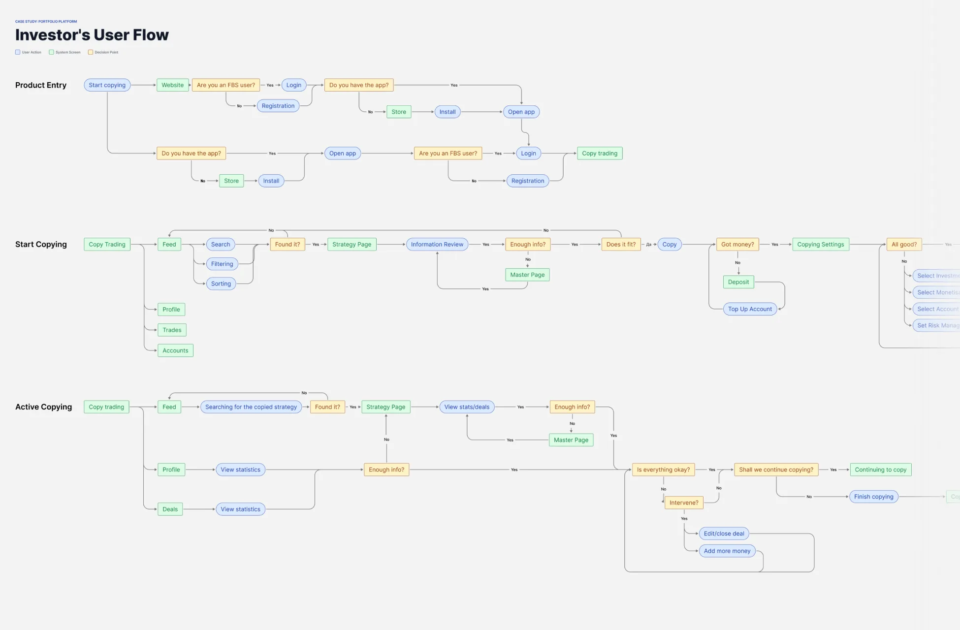
I turned the findings into architecture diagrams, user flows, and a journey map for each role – all built inside one fixed limit.
We used a ready-made backend, chosen for cost and speed. It set the number of accounts, how offers worked, the copy formats, and the analytics I could use.
I designed the flows to fit those limits instead of fighting them.
Product & decisions
The architecture call: a separate app, not an embed
The easy option was to put CopyTrading inside the existing trading app – instant users, no marketing cost.
I argued against it, on three risks: the trading app had a history of regulator and app-store blocks, including one permanent one; it was built only for trading, so adding CopyTrading meant rebuilding its whole structure; and that rebuild would break the budget and the deadline.
The cheapest way to reach users carried the biggest risk. We built a separate app.
The product: where "protect the investor" becomes real
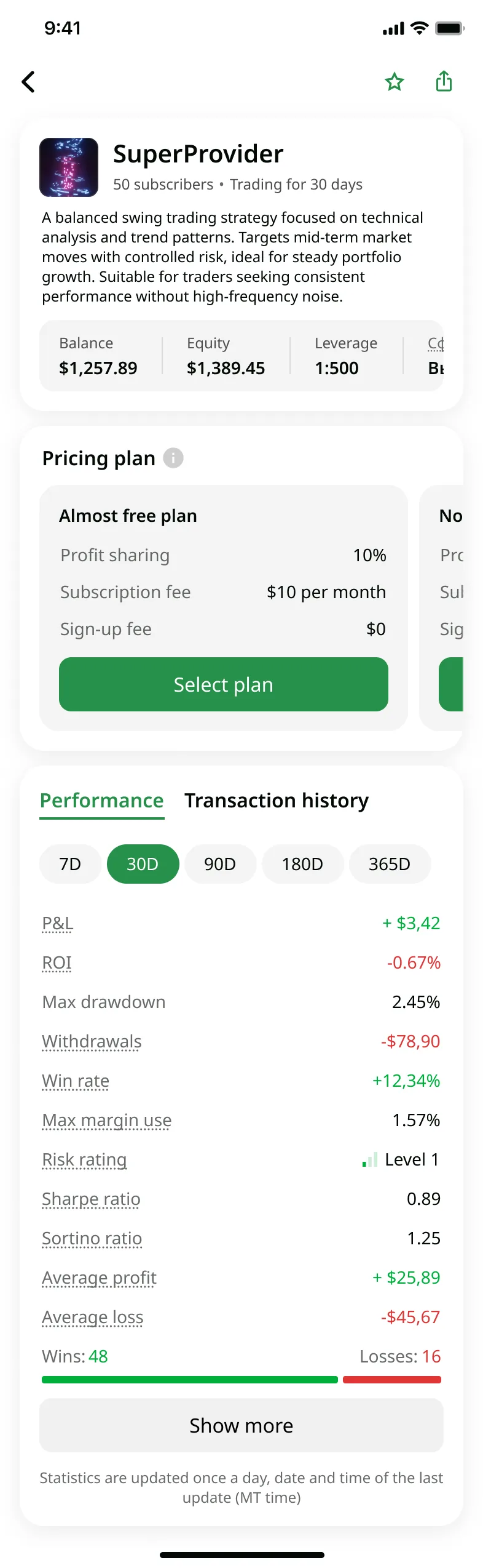
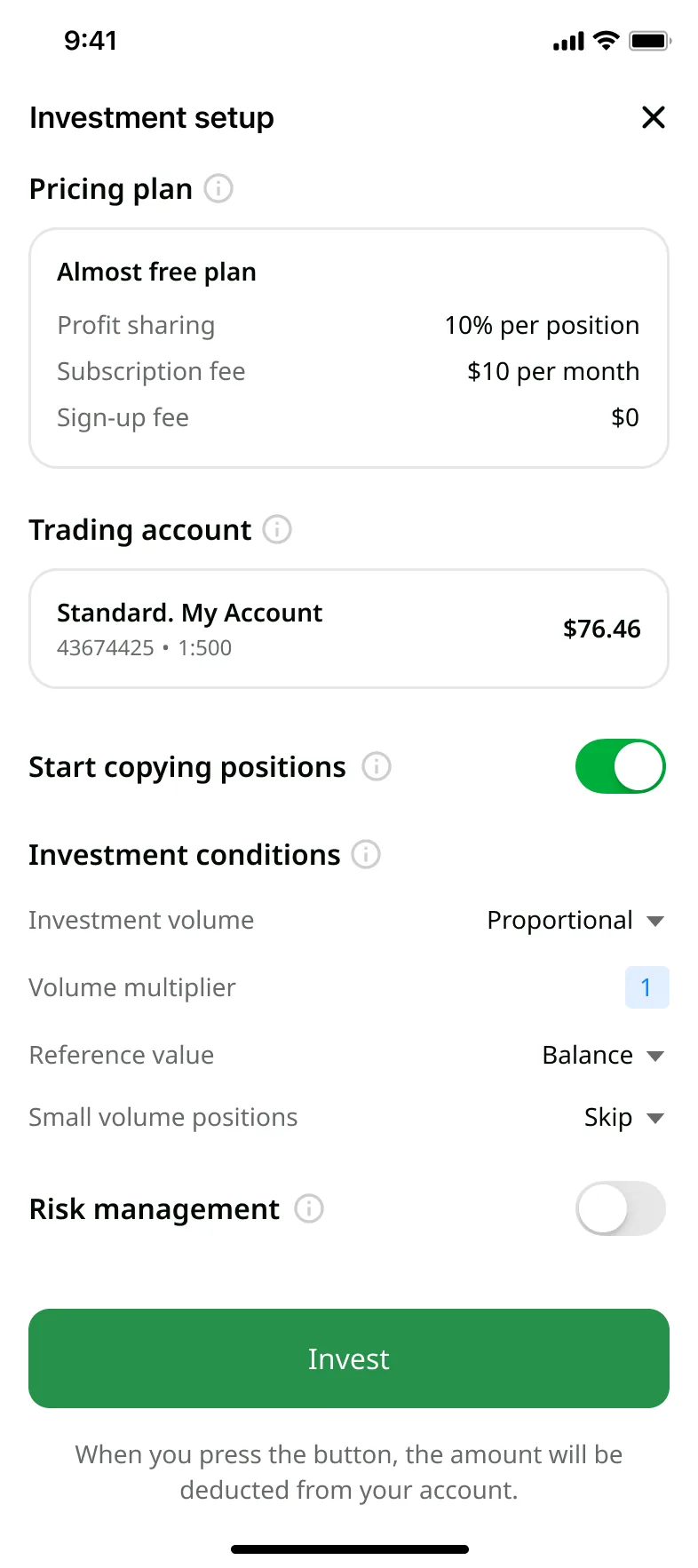
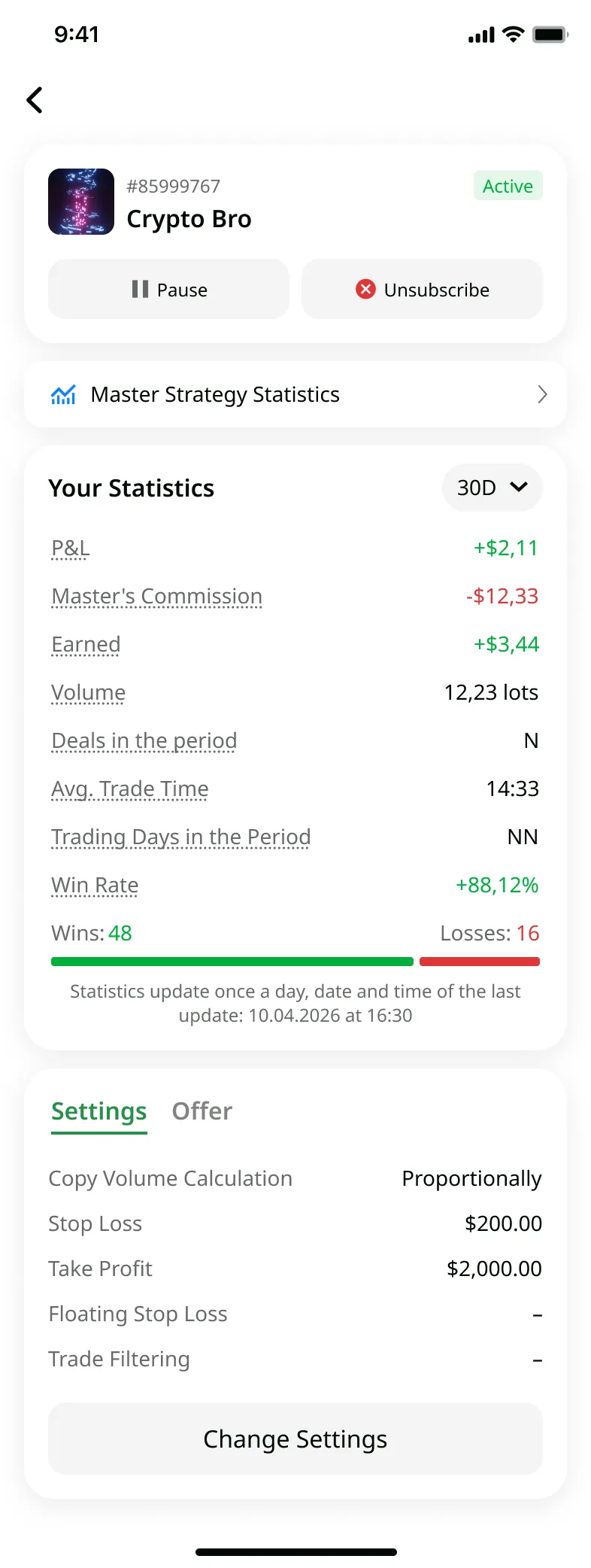
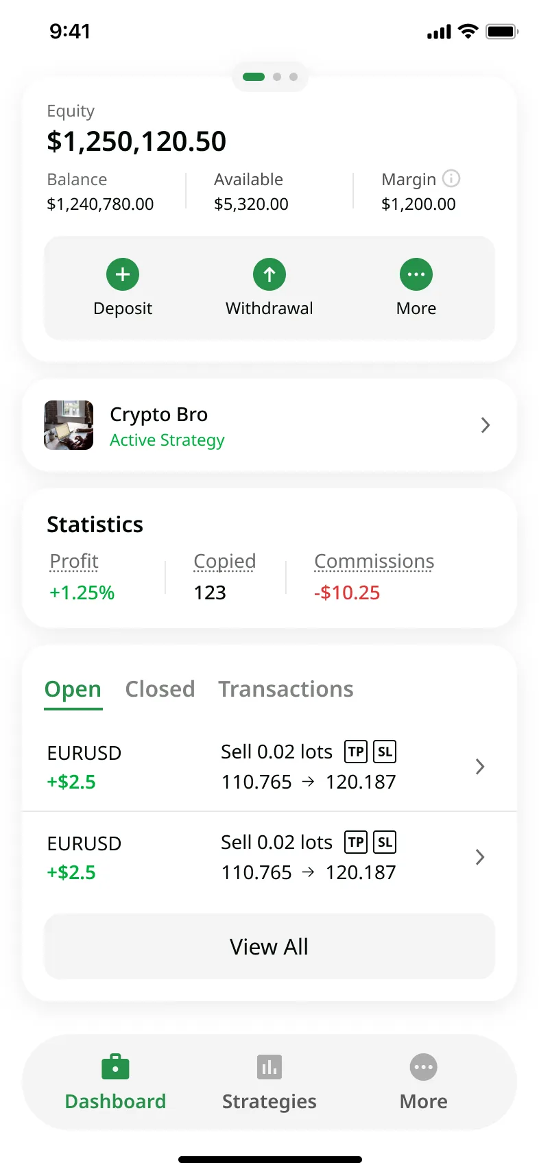
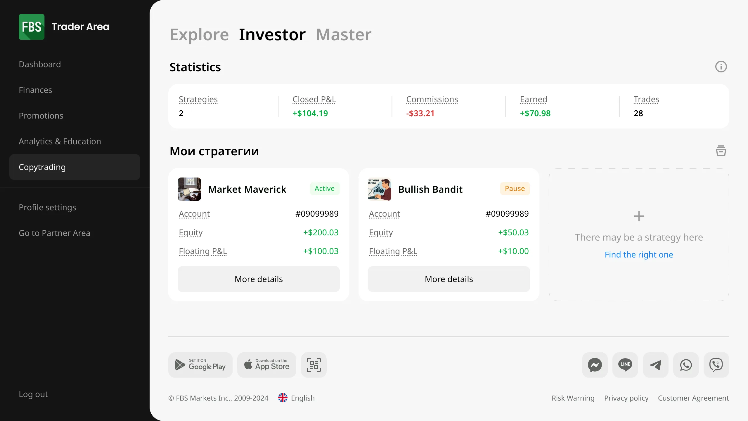
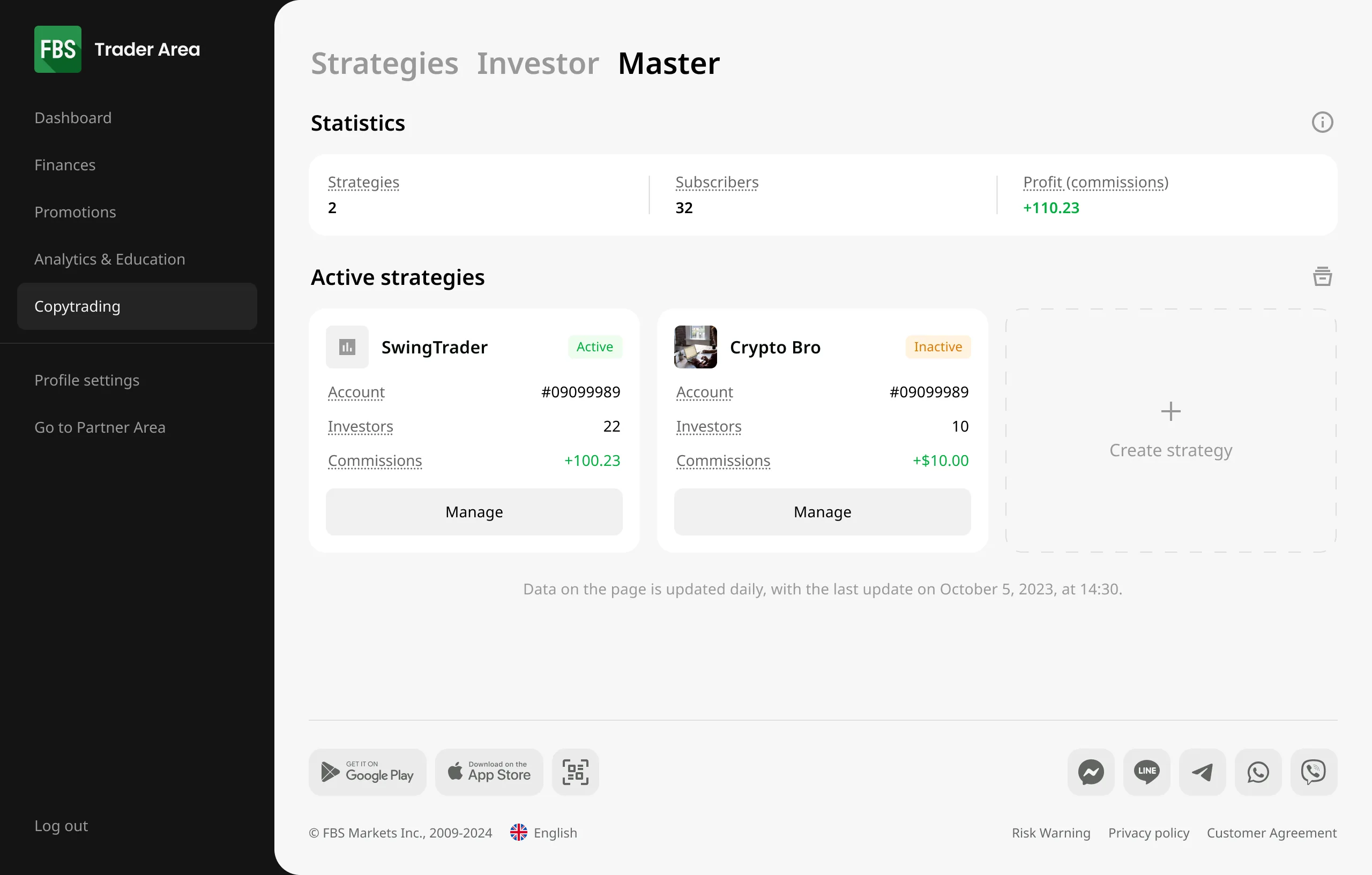
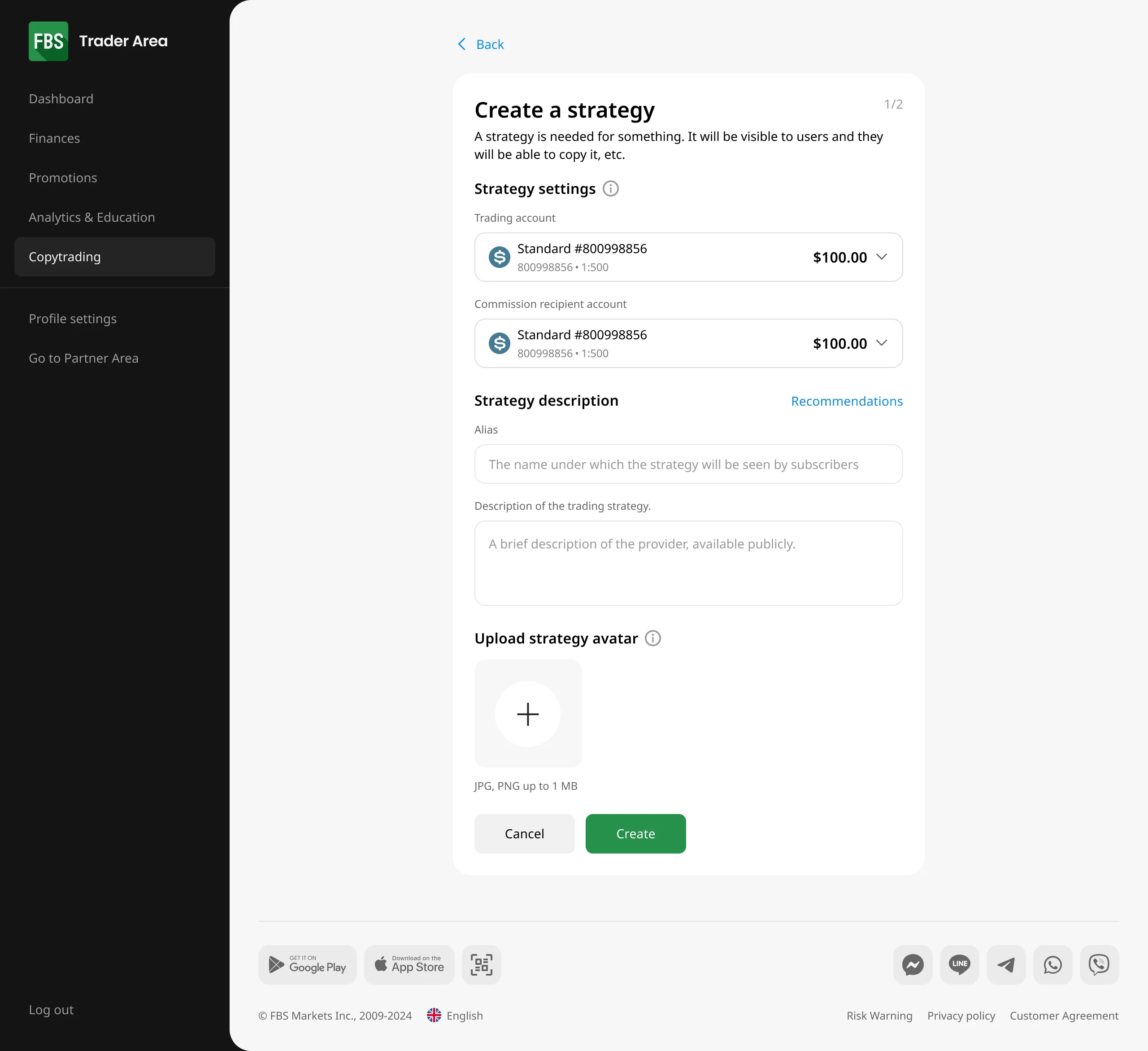
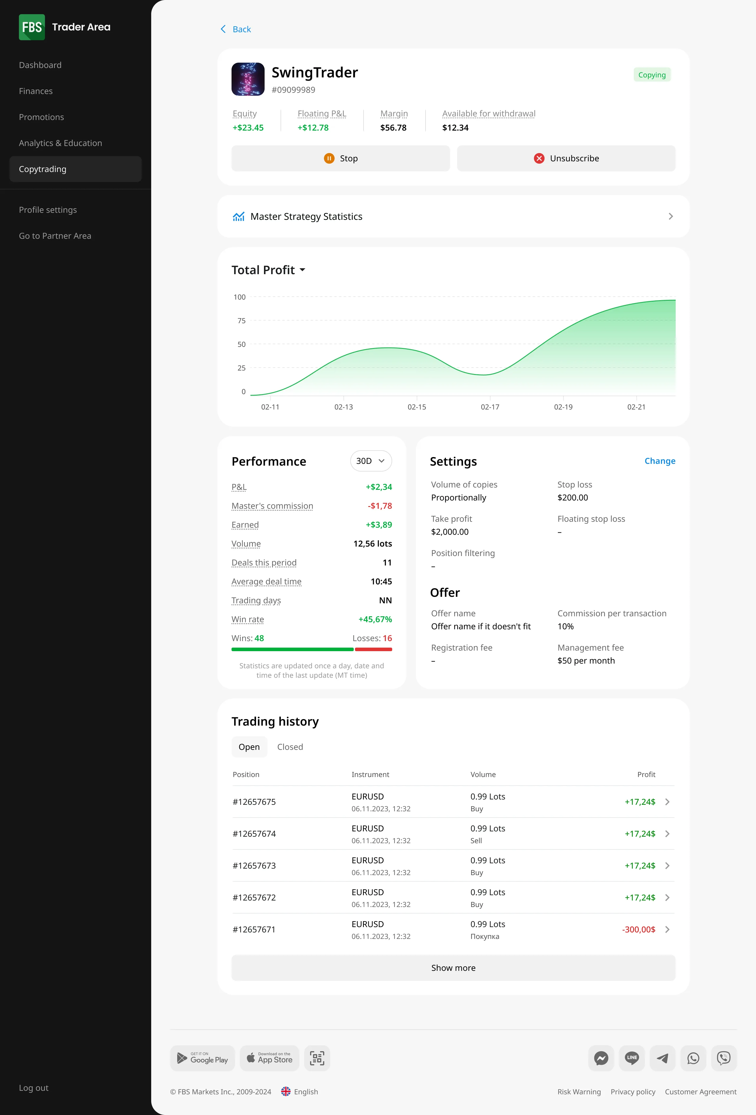
Full product across both roles. The master creates a strategy, sets how they get paid, and manages it. The investor discovers a strategy, reads its stats, sets copy parameters, starts copying, and reviews results.
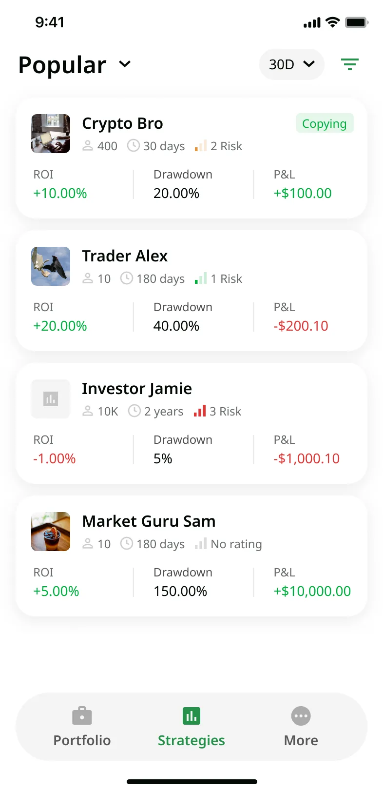
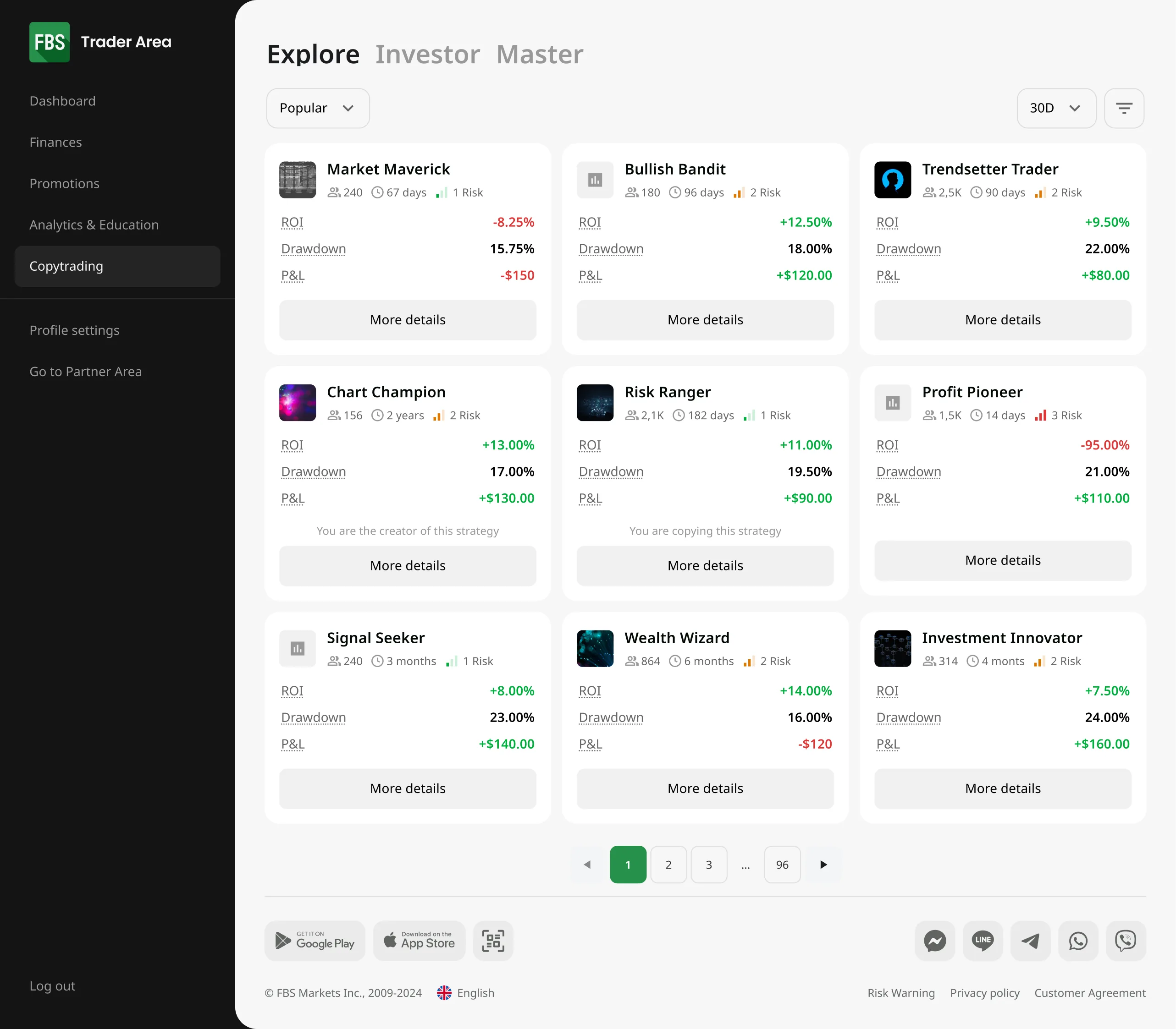
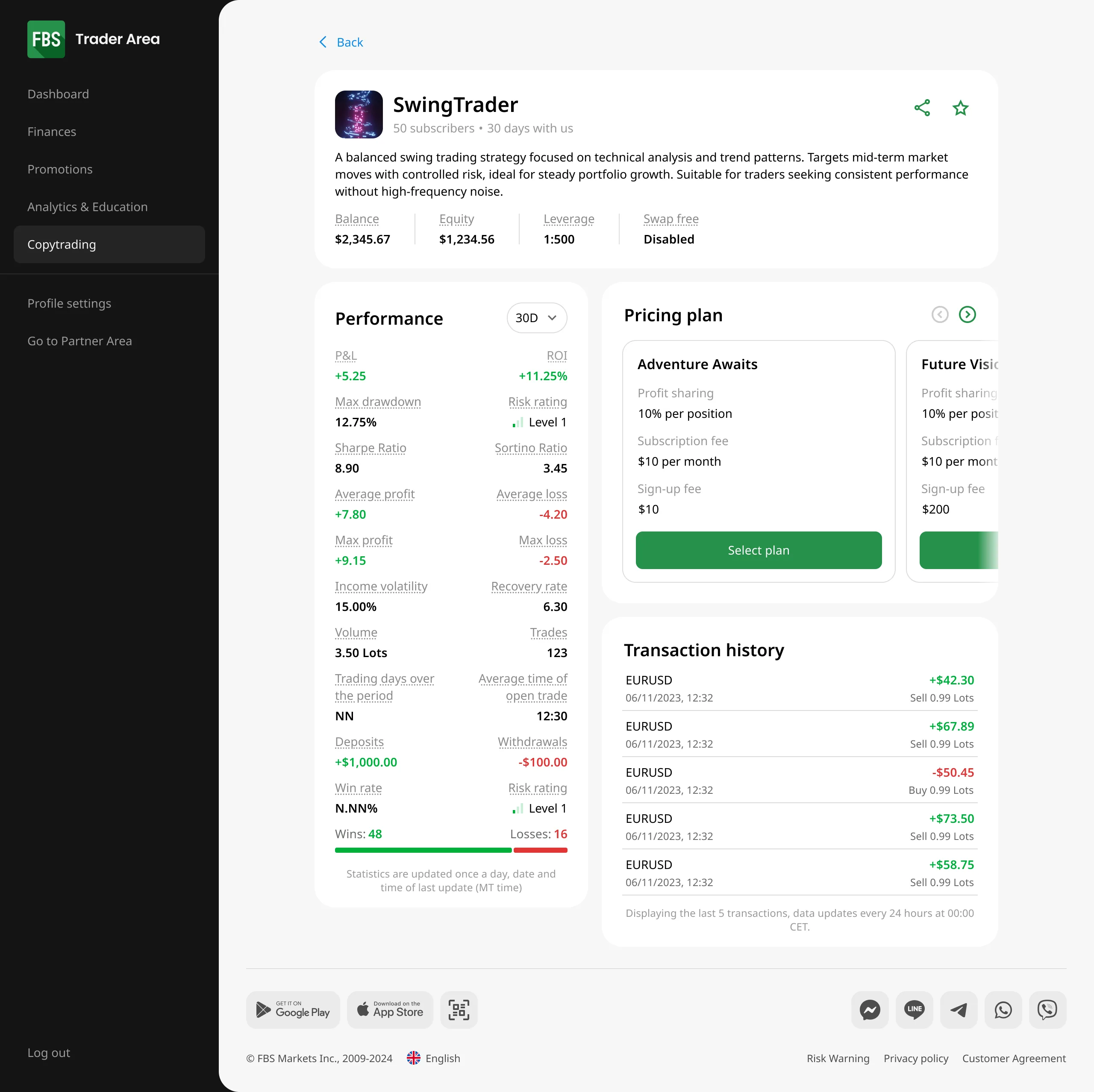
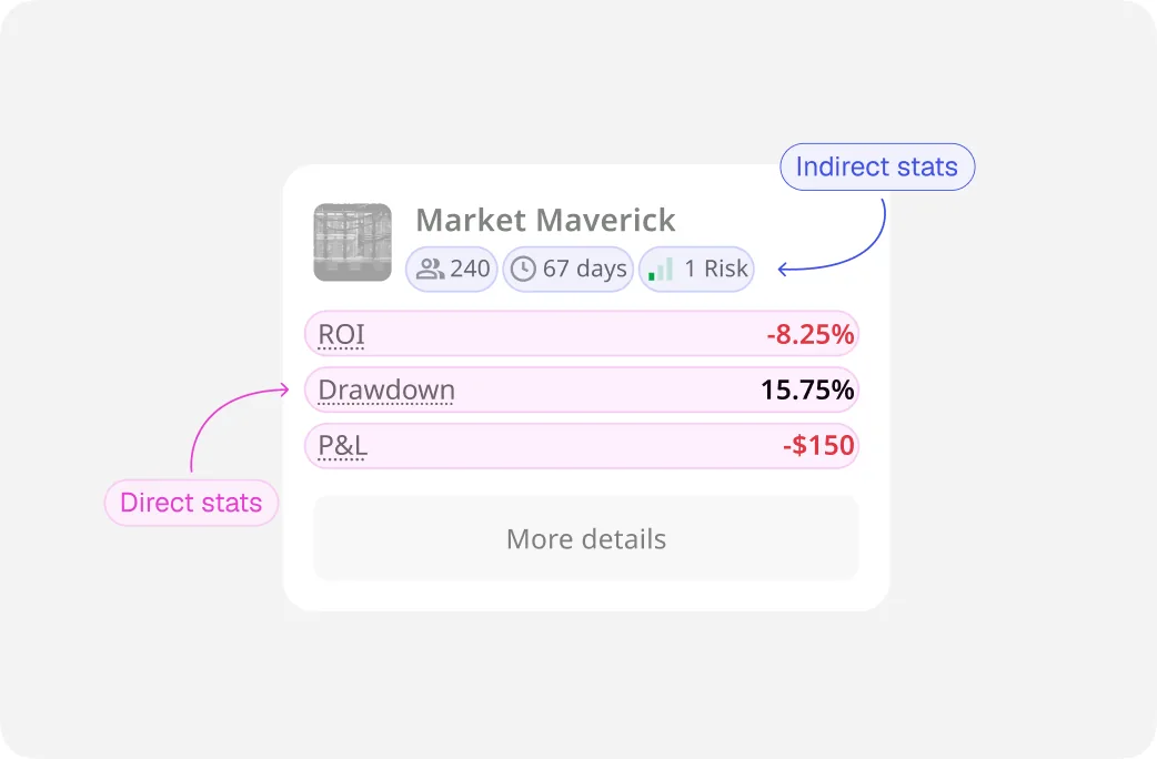
The clearest place the stance shows up is the discovery screen. A beginner picks who to copy from a few numbers – so those numbers are a safety choice, not decoration.
We researched which stats tell the truth about a strategy instead of dressing it up, and landed on six. Three are direct: ROI, drawdown, and P&L. Three are indirect: how many people copy it, how long it's been running, and a risk score we built. You can tell at a glance whether a strategy is any good, and one flashy number can't fool a newbie.
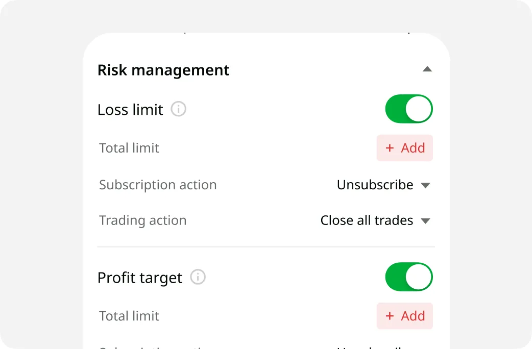
The same stance shaped the copy controls: fine-grained limits and a manual close, so the investor stays in control of their own money.
Mobile: investor-only, on purpose
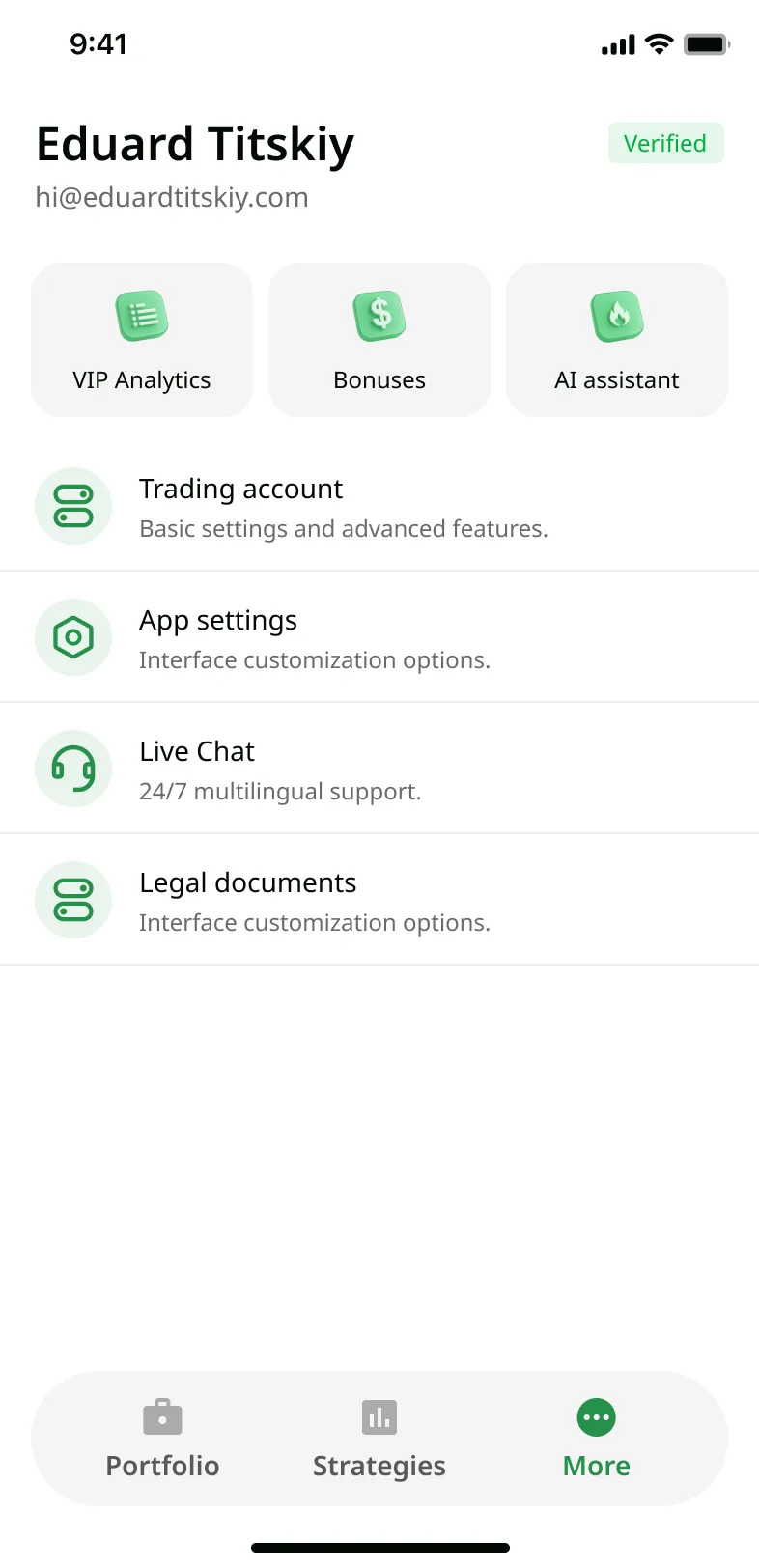
The mobile app carries the full investor loop – discover, set copy parameters, copy, review. It has no master flow, and that was deliberate.
Masters work mostly on desktop, and building the full master side on mobile was expensive for little return.
Cutting it fit the stance, too: the product is built around the investor, so the investor's experience had to be everywhere.
A pragmatic design system
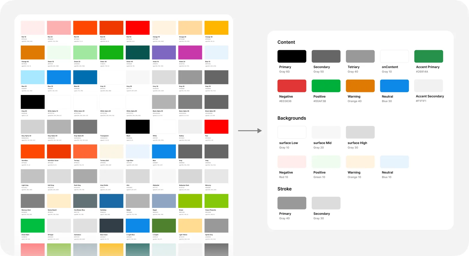
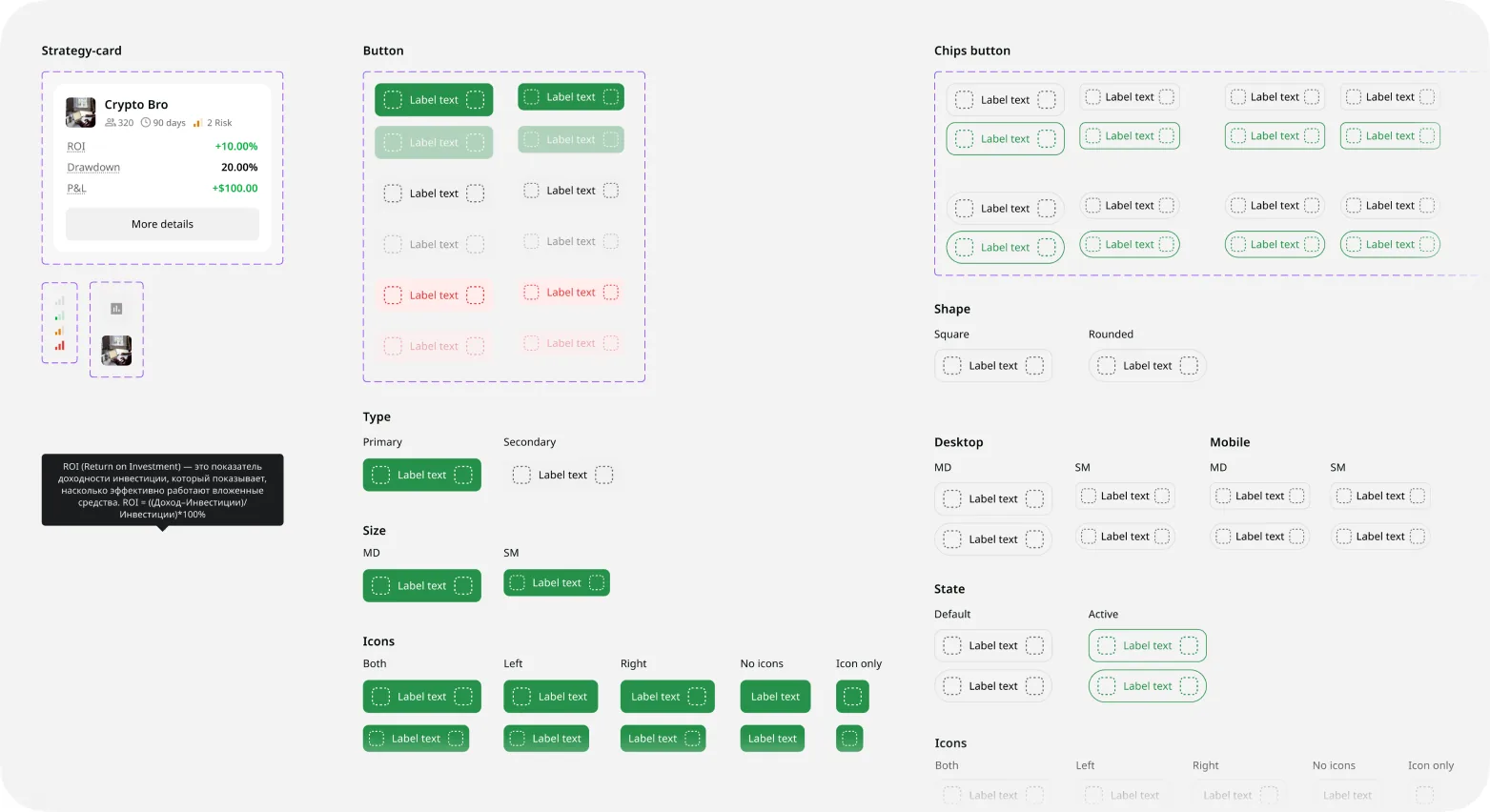
The web cabinet had no real system – about a hundred unassigned colors. I didn't rebuild it. I took the minimum: reworked the existing kit and pulled a small set of tokens from production, just enough to ship.
Validation
Before handoff I built a prototype and ran a moderated usability test on the two core flows – the investor finding and copying a strategy, and the master creating one. This checked flow and wording, not scope: can people move through it, do the terms make sense. It surfaced a few small copy fixes, which I made before the final handoff.
Learnings
In a marketplace where one side is set up to lose, the first design decision isn't a screen – it's whose interests you protect. We chose the investor, and once that was clear the hard calls got easier: which numbers to show, how much control to give, even what not to build. Pick the side you protect, and the product falls into place around it.
The architecture lesson held, too: the cheapest path, embedding, carried the most expensive risks. Naming those risks out loud is what kept the team from spending a quarter rebuilding the wrong thing.