Private Banking and a web UI kit
Context
MTS Bank is one of Russia's top-20 banks by assets and a market leader in POS lending. I joined the web team as a Product Designer and, within a few months, stepped into leading it. Over the year I carried two directions in parallel — one product, one infrastructure.
What we did
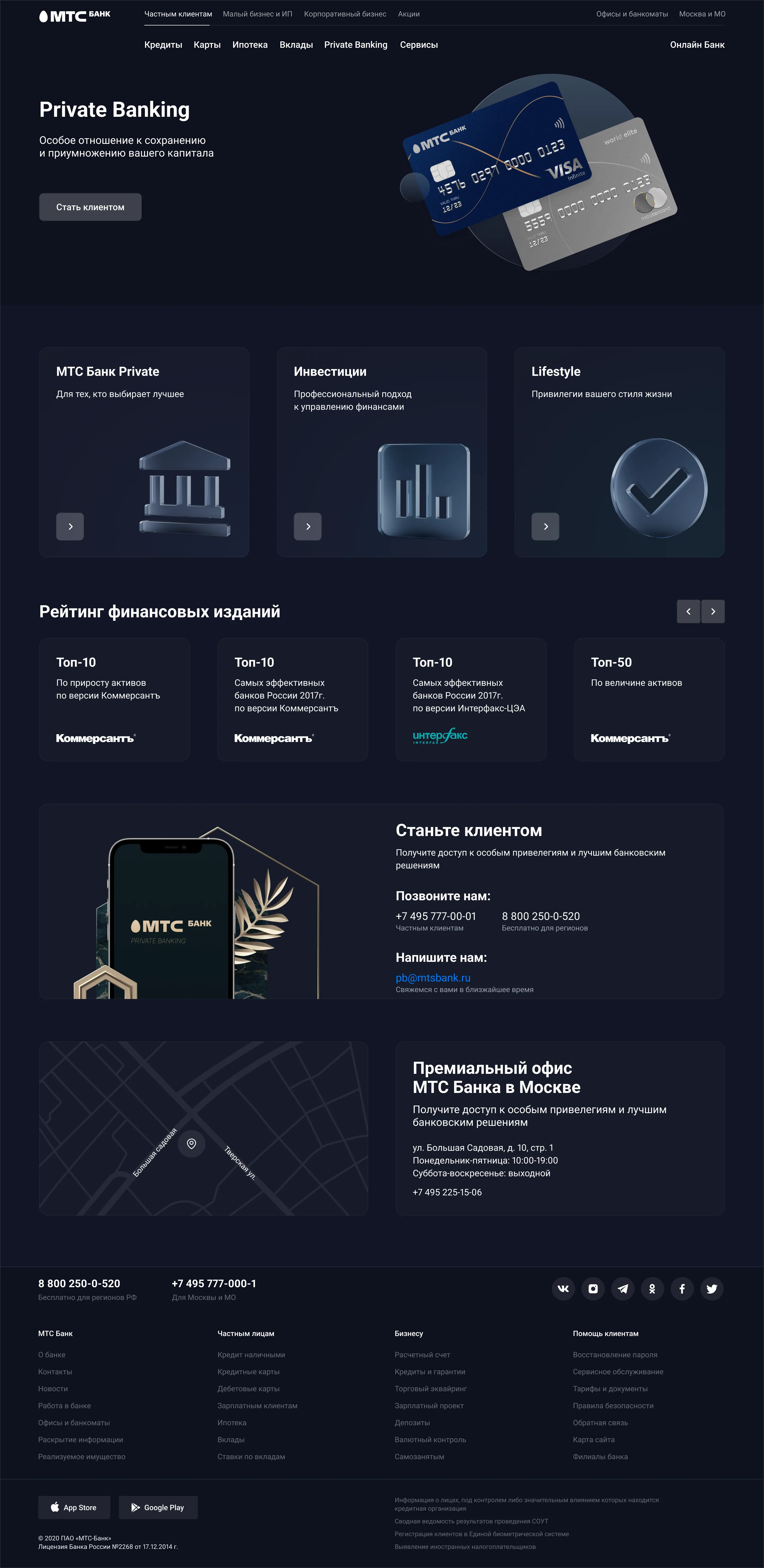
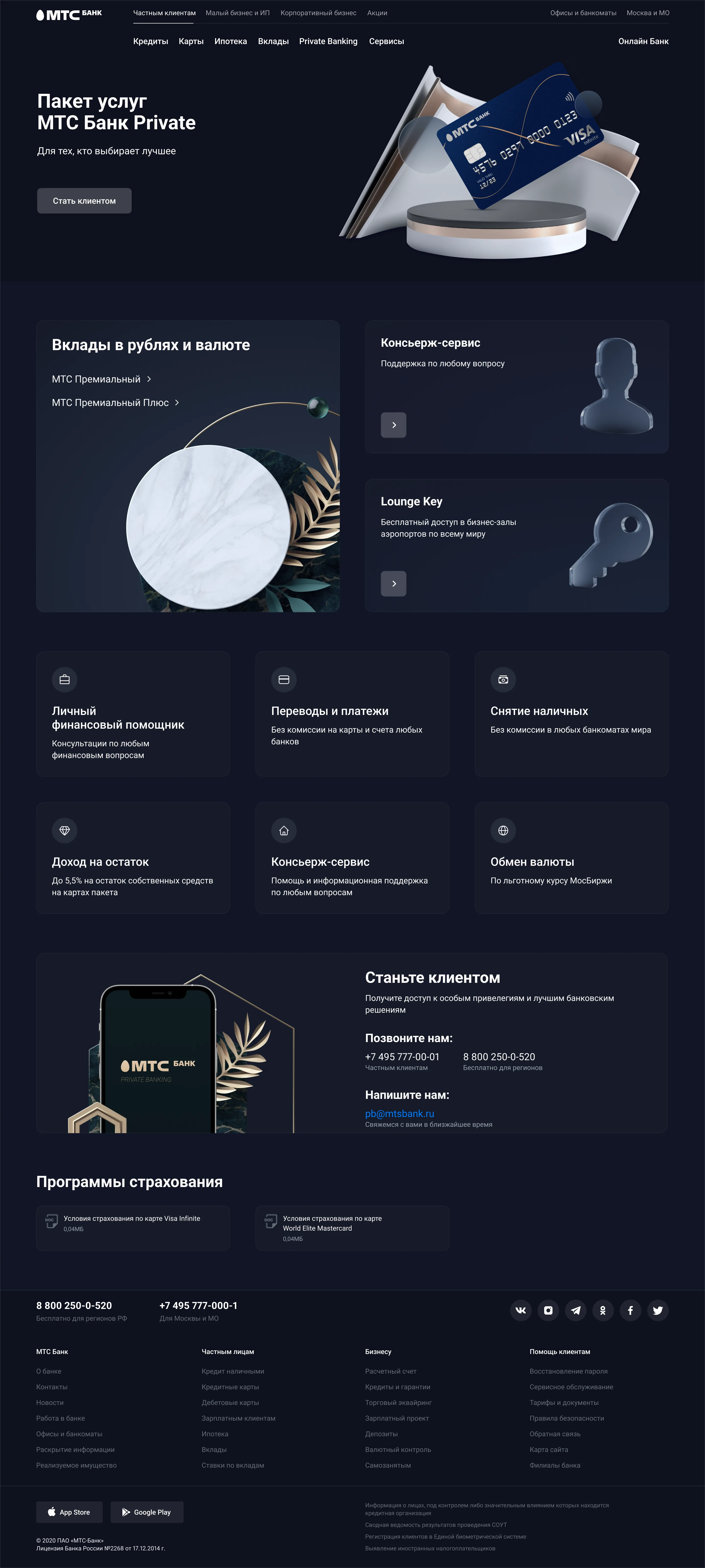
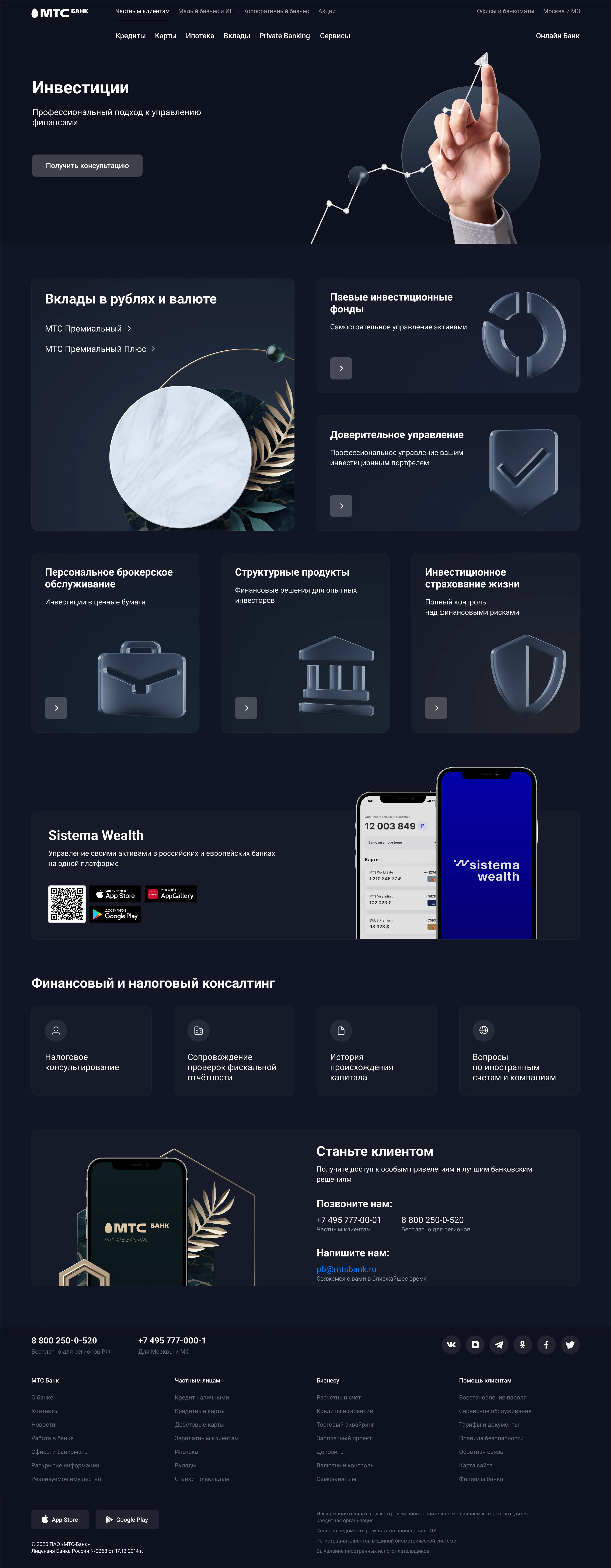
Private Banking: a new section from scratch
Private Banking didn't exist on the site. High-net-worth acquisition was happening through the general site, with no product experience tailored to the segment.
We built a dedicated visual theme on top of the core design system, adapted the base UI components to the theme, and designed the full section: the main page, product pages, and landings — 20+ pages in under a month. The speed came from the design system, not around it: the theme sat on the existing foundation instead of forking from it.
Result
New-client acquisition conversion in the Private Banking segment ×2.
Web UI kit: refit on the shared library
The web component library the whole team relied on had drifted. Designers were losing time tracking down the right component states; layouts were diverging from engineering; tickets kept coming back from review.
Ran an audit of the library and surfaced the real problems — inconsistencies, duplicates, and gaps. Brought components to a single standard. Documented how to use them so the rest of the team didn't have to re-derive the rules on each task.
Result
Landing-page work got measurably faster — Jira throughput down around 30% in task time. Rejected and returned tickets after design review dropped by roughly the same amount.
Result
Two directions in a year — one the visible product surface, one the infrastructure under it. Private Banking proved how much a disciplined design system speeds up product work: 20+ pages in under a month, with conversion doubling on the segment. The UI-kit refit proved that infrastructure work shows up in business metrics too — less rework, faster landings, fewer rejected tickets.
Banking also trains precision. There's no room for "close enough" in fintech — every screen goes through several rounds of review, and that builds a habit of getting the details right the first time.