 Index
Web design system for a trading platform
About
The company runs a regulated CFD broker for the Indonesian market. Its web client area is the front door every user has to go through: register, verify, fund an account, start trading.
I was the Product Owner and also designed the system. The task was to redesign the whole web product, ship KYC and billing to the app as WebView modules, and keep the product running while we did it.
Outcome
The whole client area, from registration to dashboard, runs on one token-based system. One token set serves three surfaces: the web client area, WebView modules in the app, and email.
On the flows rebuilt on the system:
The system was one of several changes behind these numbers, alongside the funnel redesign and ML scoring of verification applications. KYC and billing WebView modules also load noticeably faster: lean Angular modules and Go services built for the app's scenarios replaced PHP pages.
Problem
The client area was old and technically outdated. Vanilla HTML and CSS on the front end, PHP on the back end, and no design system: every screen was styled by hand, so each change took longer than it should and the interface kept drifting.
The mobile app opened two parts of it, KYC and billing, inside a WebView. Users felt it: slow screens that did not look like part of the app.
Build, not buy
We weighed three options.
Keep the legacy stack and add a style guide
Cheap, but the WebView stays slow and every redesigned screen gets built twice.
Adopt an off-the-shelf library such as Angular Material
Fast to start, but heavy for a WebView, hard to bend to the brand, and theming only within Material's model.
Build our own Angular system on tokens and move the back end to Go
Slower to start, but we ship only the components we need, control the visual layer completely, and switch themes through tokens.
We chose the third.
Three layers of tokens
Global tokens hold raw values: seven color ramps of twelve steps plus white, spacing and radii. Semantic tokens give them roles such as background, content, border and status. Component tokens tie buttons and inputs to global values.
A theme is just another set of references. Component tokens show up in the component browser further down.
Foundations
Every measurement is a multiple of a 4px base module: spacing, radii, the grid. In the Figma docs every ramp had its own Pokémon, so here the ramps keep their names.
| Specs | |
|---|---|
Heading 1 | |
Heading 2 | |
Heading 3 | |
Heading 4 | |
Heading 5 | |
Headline Lg | |
Headline Md | |
Headline Sm | |
Paragraph Lg | |
Paragraph Md | |
Paragraph Sm | |
Caption |
Components
23 component families with about 727 variants, all driven by tokens.
Module by module
The product moved to the system one module at a time: registration, verification, deposits and withdrawals, then the dashboard. Sign-up got social sign-in, KYC became a sequence of steps under one progress bar, and a deposit takes three steps from amount to confirmation.
KYC and billing shipped from the same code twice: in the web client area and as WebView modules inside the app.
The same module had to work in a desktop browser and inside the app, so the client area got one simple layout: a single content column of fixed width. It stays 792px at 1440 and 704px from 1024 down to tablets; only the side margins change with the window. On phones the column fills the screen minus 16px margins. A module designed once looked the same at any width, and its WebView version was the same column at phone width.
The dashboard came last and turned the modules into a new client area: the trading account with deposit and withdrawal one click away, MT5 details, transaction history and the apps. The live version below is in Indonesian, as in production. Switch it between light and dark. Dark follows the system rules; in production it shipped in email.
Hari ini
19 Mei 2023
Deposit dengan
Tidak dikenakan biaya




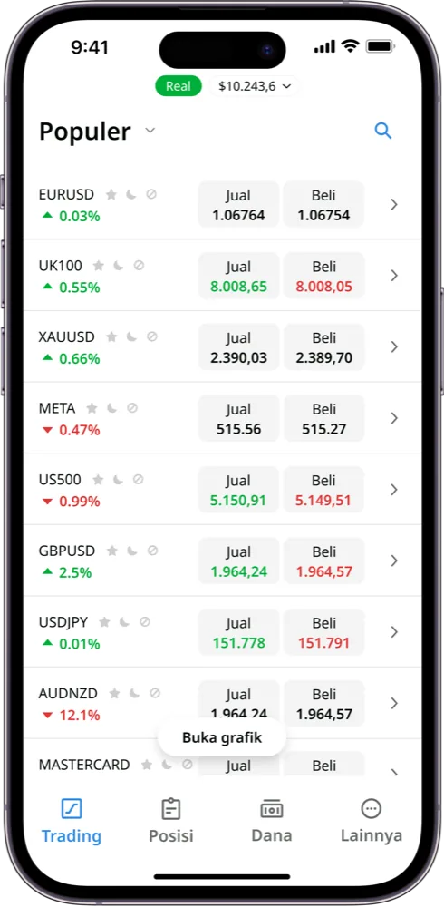
Aplikasi Trading: semua yang Anda butuhkan untuk trading
Trading aset-aset unggulan dari mana saja. Kelola akun dan keuangan MetaTrader Anda. Satu aplikasi untuk semua kebutuhan trading.



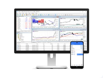
MetaTrader 5
Platform trading profesional untuk desktop dan seluler.


Same tokens, more surfaces
The company website was built on the same components. The newsletter kit reused the tokens too, so emails supported light and dark from the start: mail clients switch the theme with the system setting. For the web client area the dark theme was specified as rules, but had not reached release by the time I handed the product over.